
domingo, 20 de novembro de 2016
Jeremy Mann Color Study.
Well, i didn't get my materials for still life. So, to still study some painting, i decided to tackle some color study of this great painter (yeah, i really like his work). I started with color directly, shapes and blobs. It was tough, i missed some temperatures, values and accuracy. My main struggle is to see the right value within the color. It's far from something good, but served to show me that good structure leds to eficiency. Tomorrow, maybe i'll do some Sargent study, starting with a solid drawing.

sábado, 19 de novembro de 2016


quinta-feira, 17 de novembro de 2016
Books!
As i'm reading more books about drawing than just studying render, i cannot listen to musics with lyrics. They distract me from the actual content of the book.
So, here goes what i'm listen right now:
Hope you enjoy.
quarta-feira, 16 de novembro de 2016
Theo Katzman!
Such awesome singer! Take a look. Also from Vulfpeck <3
He is running a Kickstarter right now to his new album.
Planes of the Face.
I found one amazing painting with emphasis to the planes of the face, and i decided to do a study. Later i found the Artist who done it. He was Frederic Fiebig.


segunda-feira, 14 de novembro de 2016
Nice not well known band!
As life dynamicity, their style changed through the years, but i can enjoy listen to both. So here a few exemples of this awesome group:
Hope you enjoy!
Color quick master study.
So, i mainly did traditional anatomy studies today. To fill the gap, i did one colored study of Albert Bierstadt. Very rich of color, well planed values and cool composition. I will try to fit, at least one of these colored landscape master studies into my daily schedule.


Schedule.
Well, i've been hearing, in later days, about Dave Rapoza's schedule of study. I found it and will give a try.
domingo, 13 de novembro de 2016
Still into values!
I've done a study based at Jeremy Mann. This one turned out a little better but i'm not quite sure how to make softer transitions. Tomorrow i'll try to figure out, and also i need to stop to neglect my in depth study of hands anatomy. If you have some advices, please feel free to give'em.


Unfortunately, slower than light.
There is an upcoming VFX event that will happen here in Brazil. Following the vibe, i decided to do an bigger post about VFX of lightning in movies and how to translate the mindset into painting studies. So, let's get started!
First, the following shots presents a really cool concept of the magical powers at the movie "Warcraft" (2016), but there is one problem with it. Can you spot?


Well, as an former player of warcraft franchise i was really hyped with the movie. The orcs were impeccables, but i couldn't buy the magic. At the moment i wasn't sure why, but recently i figured out.
The whole problem is with the photonic intesity difference between the pratical lights attached into the actor and the CGI VFX done. If you look close to the Second image, the value in the center of the magic is 100% brightness. But the whole character value structure isn't matching that light source.

(Greyscale version of the image showing the past it feel of the VFX)
Another movie have done it better. Watchmen (2009), for me, was more concerned with how pratical lightning is extremely important to the realness experience. The good quality of the next shot is an exception in the movie. In most scenes it falls into wrong hue matching and also some value problems, but i really like this five years older FX than Warcraft's one.

Keeping that in mind, it becomes more manageable to reproduce realistic feel to a painting. So here goes some examples of well-done lightning situations in illustration:

(Chase Stone - http://chasestone.deviantart.com/gallery/)
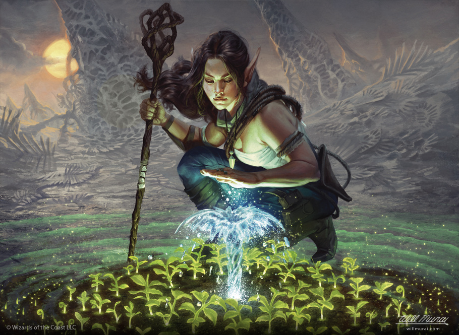
(Will Murai - http://cargocollective.com/willmurai)

(Tyler Jacobson - http://www.tylerjacobsonart.com/)
So, it is my first longer post. With new discoveries i will bring more cool things and tips within posts like this. Hope it bring some light into your paintings!
PS.: Interesting video about the behind the scenes!
sábado, 12 de novembro de 2016
Well...
So, i did the master painting after Velazquez. I definitely need to work more on brushwork and better lay-out of values. In fact i spent a lot of time at just correcting values. Tomorrow i might do some Steve Huston or Jaremy Mann master study...


Values!
I could'nt post them yesterday, so here they go. The first base on Wesley Burt and the second on Karla Ortiz. Those two really inspires me.

Right now, i'm doing a master study after Velázquez. He is such a great painter. I'm focusing in values and tonal arrangement. Fun fact: I live at an apartament with his name. :)
quinta-feira, 10 de novembro de 2016
More music discovery!
Gosh, i'm in love with this kind of music. I really likes to wide up my music spectrum. Soon i'll share some progressive stuff that i like, but, by now, just listen to them! Enjoy!
PS.: They already met this speech pathologist called Antwaun Stanley!!!!! lol
Value Grouping + Comp study

terça-feira, 8 de novembro de 2016
The Expanse!

Well, i just found this incredible sci-fi netflix show. It's called The Expense. Such a pretty artificial lightning and awesome colors. Felt the urge to do some studies. Because that XXIII century look, hope the studies about show helps me to figure out more about gamut maps.
quinta-feira, 3 de novembro de 2016
Well...
So, i missed two days of the 100 heads, but got back. I'm quite confused about what should i'm supposed to learn. And my style still quite far from now, but the journey goes on.
Also, it's quite funny how this blog will work like a bridge between the present and the future versions of myself (myself? haha). Just needed to point this. See you!
Also, it's quite funny how this blog will work like a bridge between the present and the future versions of myself (myself? haha). Just needed to point this. See you!
Assinar:
Postagens (Atom)